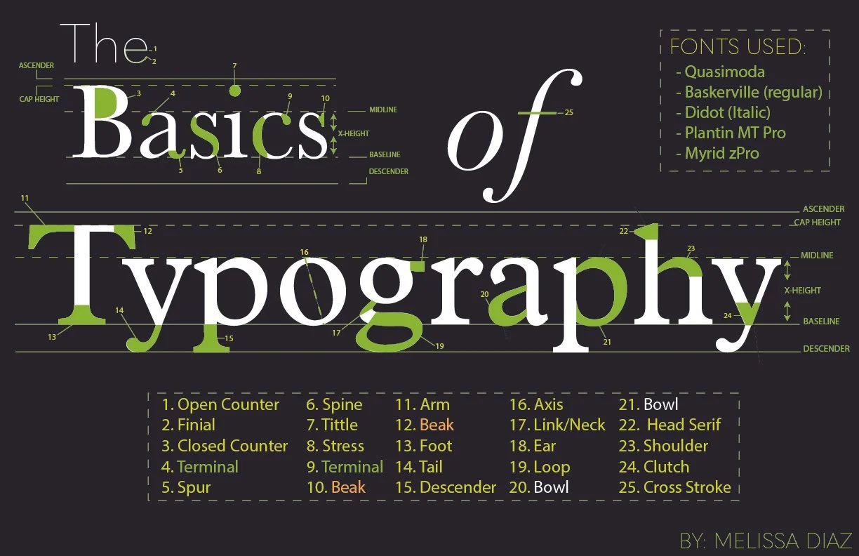
Typography, the art and technique of arranging type to make written language legible, readable, and appealing, encompasses a range of fundamental principles. At its core, typography involves the selection of typefaces, the arrangement of text, and the spacing between characters and lines. Typeface selection involves choosing fonts with distinct personalities and characteristics that align with the intended message and audience. The arrangement of text considers factors such as hierarchy, emphasizing key information through variations in size, weight, and style. Additionally, attention to spacing, including kerning, leading, and tracking, ensures optimal readability and visual harmony. Typography serves as a powerful tool for communication, conveying not just words, but also mood, tone, and message through the intricate interplay of letters and design elements. The project was to make a poster to point out every element within the basics, making it easier for the audience to under the type in design. I went for a green and black approach to make it easier to read, laying out everything accordingly. This is definitely one of my most proud assignments ever made.

